
“Data! data! data!” [Sherlock Holmes] cried impatiently. “I can’t make bricks without clay.” – The Adventure of the Copper Beeches, Arthur Conan Doyle (1892).
Even a data dinosaur like me — I completed my graduate work in 1982, in the days when acoustic couplers were plopped into modems — is having to learn more and more about data applications for scientific research, i.e., for submitting manuscripts on the front end, and for text and data mining (TDM) of aggregated articles on the back end. More and more, such research outputs require the inclusion of the underlying data, as well as representations of that data in new and more informative ways.
If we think about the richly deserved praise heaped upon the data scientists at Johns Hopkins University for their work in tracking COVID-19 occurrences, we immediately see the explanatory power of a great interface — one that is backed by multiple data sources — to illuminate rich, voluminous and dynamic data. Data visualization is a much-studied area in computer science, and it appears to be taking its star turn before our very eyes. So, many of us — certainly me and perhaps you — have set about learning what we can about the topic with some urgency. Knowledge graphs, which we are going to look at in this and upcoming blog posts on Velocity of Content, are a rising example of these innovative data display techniques.
What are knowledge graphs?
With vastly more data being collected and analyzed all the time, data scientists have developed a tool for representing their insights in an easy-to-comprehend manner, which enables a user to identify significant relationships in and among the data presented in visual form. So — although there are various definitions out there, knowledge graphs are created by processing large volumes of data from diverse sources and information types and can produce two- and three-dimensional visual representations of those data in all their complexity and interconnectedness.
Here’s some helpful information about how knowledge graphs are put together, what they are used for, and what might be coming for their future application. I’ll provide a few representative examples along the way.
Visual data representation in the form of knowledge graphs differs from other kinds of data displays that readers of this blog may be more familiar with — for example, a simple spreadsheet or table (rows and columns) or a pie chart.
A spreadsheet is, at bottom, simply a table that is arranged for ease of entry and optimal storage and programmed to enable certain pre-set means of manipulation. It’s nice and orderly. What a spreadsheet doesn’t optimize for is asking questions of your high-volume data and retrieving answers to those queries in an efficient manner. Not that you can’t somehow represent relationships in a table – of course you can – but, from a computing speed perspective, getting the answer out may not be at all easy, especially for large interconnected datasets. It’s a matter of using the right tool for the right job. In other words, a knowledge graph unifies data, creating a flexible data layer “on top” of multiple data sources.
One way to distinguish between how a spreadsheet or relational database store data and how a graph database does, is that graph databases make relationships between entities explicit, compared to the more implicit connections made in other data stores. The advantage of this is it allows us to traverse these relationship in much more efficient ways. Since data visualization tools can accelerate and make easier the analysis of large amounts of information, they have great explanatory power when used appropriately. Additionally, the act of building a knowledge graph can have benefits well beyond the visualization it produces. For example, search improvements or advanced analytics can be constructed based on the learning that goes into building the graph, as well as on the graph itself or the graph and other data.
One way to explore knowledge graphs is through a visualization. The following is a handy example that I think most of our readers can understand at a glance:
As an exercise, open up a browser and run any garden-variety Google search — my example is the simple query, “What bands are hard rock?”

That little box (created on the fly by Google as a result of my query) shows various clusters of information about hard rock, which have been collected from multiple, independent sources and boxed up nicely for us. That’s a good example of the basic form of a knowledge graph.
Essentially, what you will see as your top set of results are this kind of “info cards” along the side, which imply some behind-the-screen categorization Google has helpfully whipped up for us. In other words (Google’s words) — knowledge graphs.
The data behind each of those little cards is actually graph data — which is to say, it is data represented by showing entities and relationships (“things not strings” in the slogan). While Google has opted to visualize that in a series of little text- and image-based cards, we should bear in mind that how we store data and how we represent it are two different things.
Creating a knowledge graph to compose a response to that query (“Tell me about hard rock music”) was computationally easy because Google has a good design for this purpose, and handy access to all the people nodes connected to a describable set of musical characteristics (‘hard rock’), albums and singles, labels, and so forth.
Next, we’ll look at an example of knowledge graph, one that CCC has developed in the context of the scientific publishing ecosystem, specifically focusing on its potential use in aiding editors in moving along the peer review process.
CCC COVID Author Graph: an implementation of this representational technique
CCC, as a technology leader in scientific publishing and research, is constantly in conversation with publishers and researchers, and one of the things our data experts have been exploring recently is a knowledge graph that shows relationships among researchers writing about COVID:
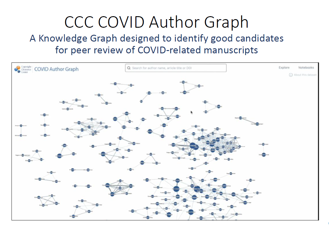
The CCC COVID Author Graph helps illustrate the power of visualization of a publisher’s data, given the current set of challenges in peer review. For that use case, CCC’s metadata experts created an aid for editors working in the COVID-19 space who are responsible for identifying and selecting high-potential peer reviewers for articles that have been submitted to their journals. In developing the COVID Author Graph, we extracted the metadata for more than 107,772 articles, using research articles on COVID-19, SARS & MERS for our dataset — representing the work of 400,299 authors — that are included in our graph. We further populated it with 29,102 articles that are unique to LitCovid, and 70,801 articles that are unique to CORD-19.
Basically, CCC created an intelligently filtered, visually clear, and accurate view of all those authors and the publications their articles have been published in, as well as other relevant data points, such as co-authorship as well as other relationships among authors, institutions and publications.
“Think of a knowledge graph oriented by article (i.e., the node is the article and not the author) and showing citations of articles (i.e., the edge in the graph is a citation and not an author collaboration like we do in the author graph) is another very useful graph to explore.”
– Stephen Howe, CCC Senior Product Manager – Analytics
The main point of illuminating datasets through a knowledge graph is that it provides the user with immediate access to new and powerful perspectives on the underlying data. With the COVID Author Graph, we’re focusing on facilitating peer review for scientific authors and editors, but it’s clear that a knowledge graph approach could be applied to many other sorts of entities, such as those in the financial or chemical domains.
CCC experts are speaking about our work with knowledge graphs at the Outsell Signature Event panel on “Using AI to Create Collaboration, Partnership, and New Business Opportunities: Launching the CCC Knowledge Graph “ and at Innovation Panel 1 at the Charleston Conference. Click the links to register to watch them live or to receive a link to the recording.