
This is the first of two posts I’ve written for Velocity of Content, both about transforming data into actionable information. This one is adapted from my presentation at the NISO Plus 2021 Conference in February and focuses on the role of FAIR data in analytics. (For more information on the session in which I participated, please follow this link.) The second post provides a much deeper look at the role and impact that the accuracy and quality of one’s data has on the creation of knowledge products, such as a knowledge graph.
In this post, I will be discussing the role of FAIR data in building sophisticated analytics products, using CCC’s COVID Author Graph as an example. This specific knowledge graph is an example of the type of analytics you can do when you have high quality and FAIR data. Then, I am going to highlight how FAIR data enables the building of quality knowledge products; I will then finish up by describing some of the data challenges that we encountered when building this graph.
What is the (metadata) problem?
Let’s begin by talking about the problem we were trying to address and CCC’s response to it. Throughout 2020, as the COVID-19 pandemic was spreading, the global research community went into high-gear to study this virus (and the severe health conditions it led to) and to share their research in hopes of finding a solution. This increase in research output has impacted CCC’s rightsholder side customers – in this case, scientific publishers – as they encountered an accelerated need to quickly identify experts who can review all of these new COVID manuscripts.
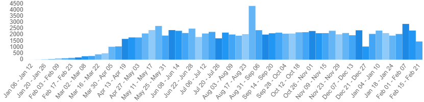
The chart above is maintained by the National Library of Medicine (NLM), and it shows the weekly count of new COVID publications. Part of an NLM communications initiative, ongoing since early 2020, LitCovid is a curated list of publications about SARS-CoV-2 and its related illnesses. And one can see from the chart that, from the beginning of May, there have been an average of 2000 new publications a week. If we momentarily adopt the perspective of a publisher overseeing peer-reviewed journals, what we have is a tremendous amount of new manuscripts to vet, edit, and release for publication.
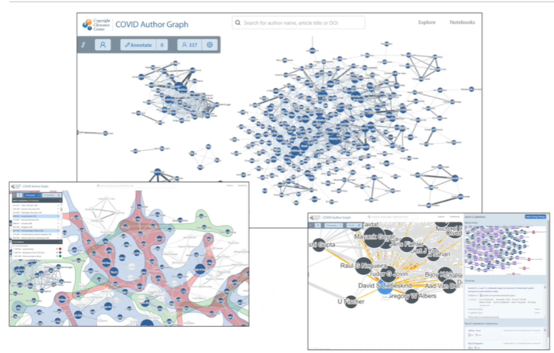
In response to this need, CCC created a COVID Author Graph as a free tool for our publisher partners. Starting with a curated dataset of published scientific articles in virology with special attention to coronaviruses, we used bibliographic citation metadata to extract authors, articles, and journals, along with the relationships among them. On top of that dataset we built a visualization tool allowing a user to explore these entities and relationships. The thinking behind this application is that the best solution to quickly identify qualified experts was to provide the user with a handy visual means of exploring the set of COVID researchers and their interconnections. Graphs of this sort provide a very natural way to interact with data that describe entities and their relationships.
In the context of FAIR data…
When I refer to a knowledge graph I am talking about the product or output of a knowledge system or knowledge supply chain. A knowledge supply chain takes data as its input and transforms that data into information —and then into knowledge. Knowledge here is understood, in the informational hierarchy sense, as ‘actionable information’.
With data as the primary input to a knowledge supply chain, the quality and value of the output is highly dependent on the quality of the source data (the input). In other words, “garbage in, garbage out”. Moreover, you improve the overall quality of the output by iteratively identifying, measuring, managing, and improving data quality throughout the system. In this context, these systems and processes highlight the role and value of FAIR data. The better (higher quality) and more FAIR our data, the more value we can (more quickly) derive from it. Confidence is key here: Information is truly actionable only if the user has confidence in it.
As an example, consider the information needs that we address with the COVID Author Graph:
- We help publishers identify qualified experts in COVID.
- We enable a user to explore the publishing relationships of COVID researchers.
But a follow-on question immediately arises: How do we extract these authors and their relationships from the available data reliably and with confidence?
Although, for the COVID Author Graph, we use data from a variety of sources, we primarily rely on data that are FAIR. Much of these data and their formats are certainly findable, accessible, interoperable, and reusable in many ways. The degree to which the data are FAIR directly determines how accurate our outputted graph is, how much work and complexity we have to build into the pipeline to make it accurate, and the level of confidence that the user has in the end result.
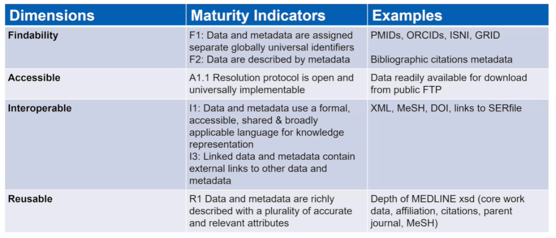
The table above describes the four dimensions of FAIR data along with some of the metrics or maturity indicators. On the righthand side are examples from the data that we used that allowed us to conduct more sophisticated analytics. For instance:
- F1: Data and metadata are assigned separate global identifiers.
- Because of a strong occurrence of identifiers such as PMID, we can accurately disambiguate data about journal articles
- A1.1 Resolution protocol is open and universally implementable
- Much of the data that we used were readily available for download via known protocol and with public access
And finally, much of the data we used were derived from well-described XML structures and ontologies, making interpretation and representation easier.
Wrapping Up: The Realities of Data
Data quality issues run deep. It is simply not the case that data can be made FAIR once and then remain static. And data are not just FAIR at one level of the data. Data quality, data findability, data accessibility (and so on) are part an iterative process that must be maintained. The realities of data are that issues are common and they present obstacles to extracting knowledge from the data. While certainly not insurmountable, these are significant issues, demanding our attention.
The main lesson we learned in building the author graph is that the more FAIR and higher quality your data is at the source, the more value you can derive from it as part of a knowledge system.
For my next post, we’ll drill in deeper on aspects of data quality, provide examples of what we observed, and discuss how they drive the accuracy and reliability of tools like CCC’s Author Graph.